Koi Fusion Concept Page
Overview
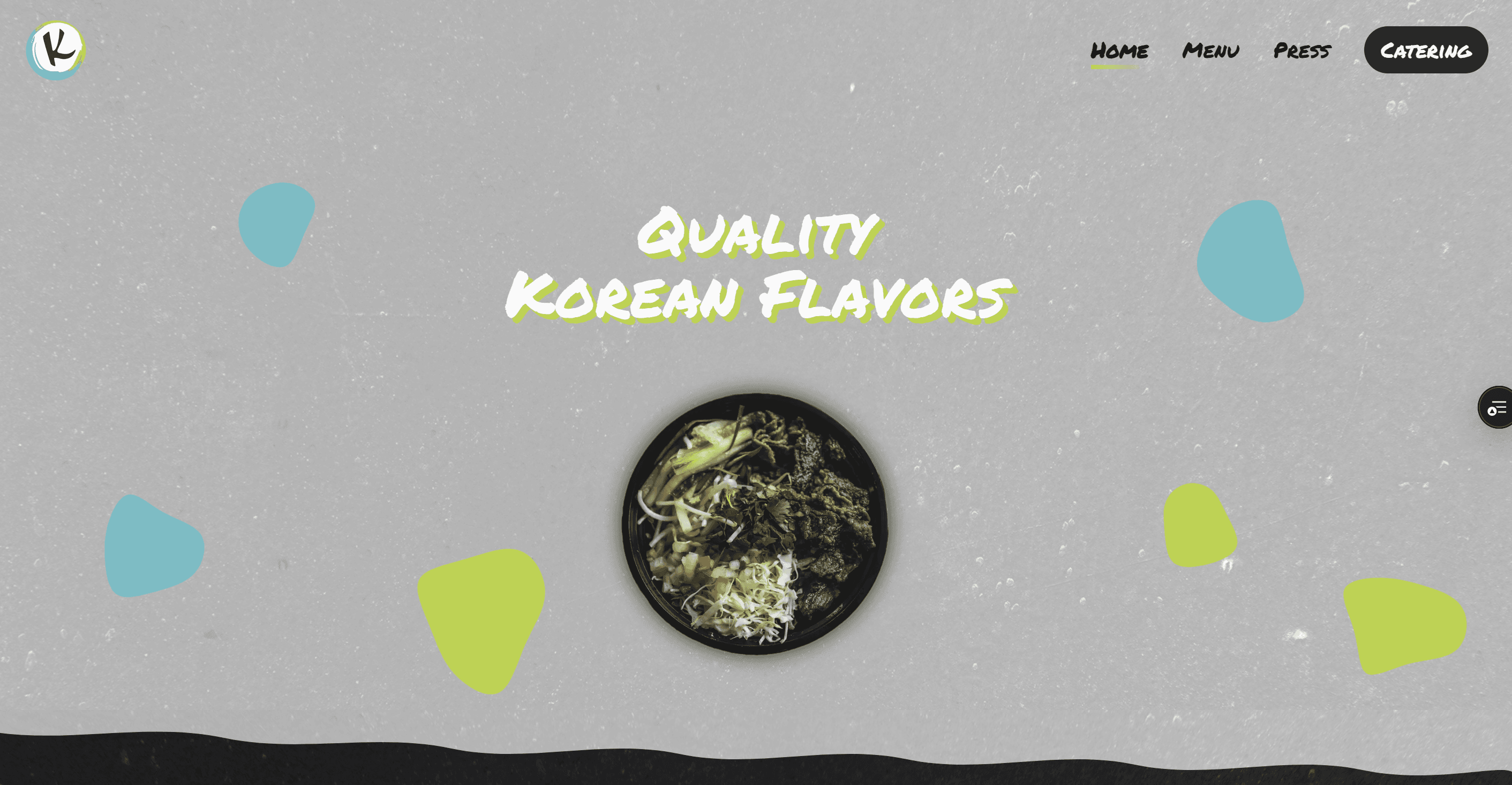
Koi is a just a landing page (nothing else) I made mostly just for fun — a design experiment to play around with a more playful, textured style of website. I took a lot of inspiration from the PDX Crusade site, especially the way they used layered textures and backgrounds to give their page a lot of depth. I wanted to try something in that same vein and see how far I could push the layout without making it feel overdone.
The Idea
I’ve always been drawn to websites that feel a little different — ones that have personality and flow instead of looking like another cookie-cutter landing page. Koi was my way of experimenting with that idea. It wasn’t a big project or anything complex, just a chance to try new design techniques and see what I could come up with.
What I Focused On
🎨 Textures and Layers: I used textured overlays and soft patterns to give the background more character and depth.
🧭 Layout and Flow: I wanted each section to connect naturally, keeping it light and fun without feeling cluttered.
📱 Responsive Design: Even though it was mostly for practice, I still made sure it looked great on any screen.
Reflection
This project reminded me that even small design experiments can teach a lot. It helped me sharpen my eye for layout and gave me new ideas for how to make future sites feel more “alive.” It’s simple, but it reflects how I like to build — experimenting, learning, and having fun with it along the way.


